When people walk into an exhibition hall, the first thing that catches their eye is color. A stand may have great products, but the colors used around it decide whether visitors stop, notice, and feel comfortable to walk in. Color is not only decoration; it shapes mood, builds trust, and influences how people interact with your brand.
What Is Color Psychology?
Color psychology explains how colors affect emotions, behavior, and decision-making. Every color creates a particular feeling. Some colors feel energetic, others feel calm, while some appear luxurious or professional. Exhibition designers use these emotional signals to shape how visitors respond the moment they look at the booth.
How Colors Influence Emotions and Behavior
A strong color can grab attention quickly. Softer colors can relax visitors. Bright colors push people to move, explore, and engage. Calm colors encourage them to stay longer and feel more secure inside the booth.
Why Color Psychology Matters in Exhibitions
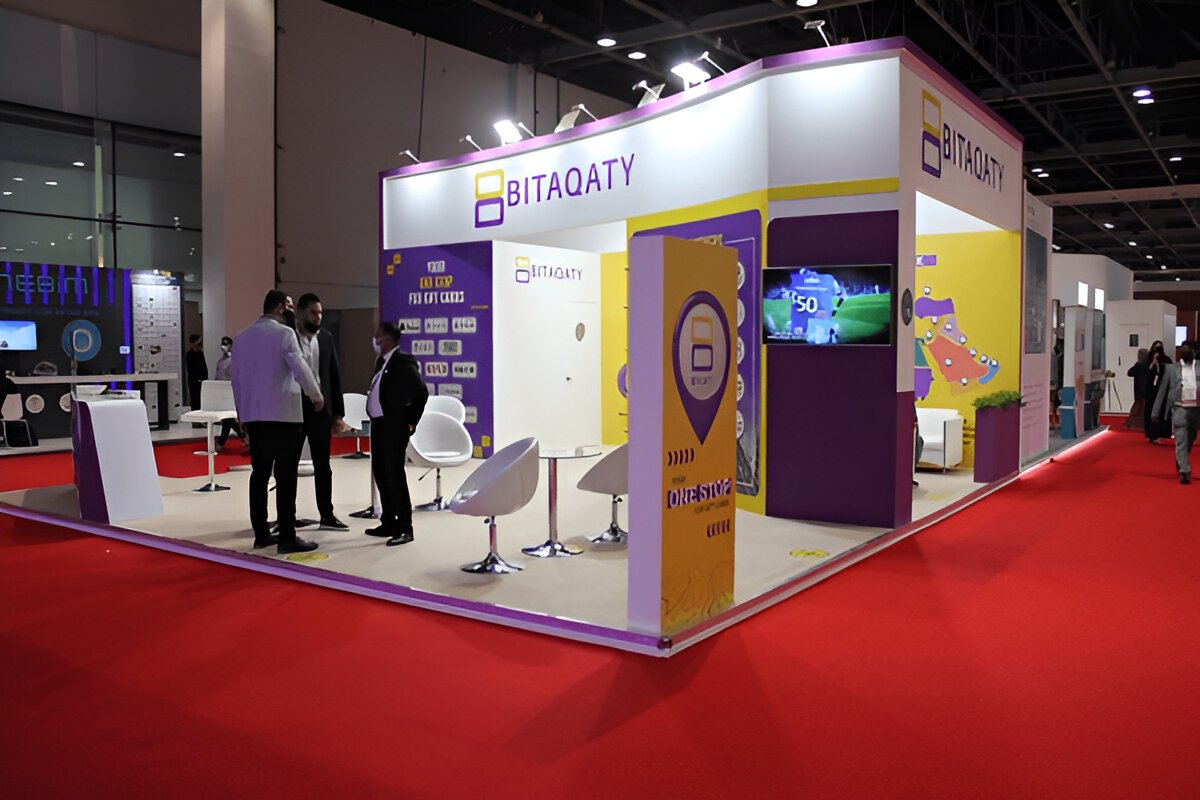
Exhibitions are crowded. You compete with hundreds of stands. The right color combination helps your booth stand out. It also signals what your brand represents—trust, energy, creativity, luxury, friendliness, or professionalism.
How Colors Affect Mood and Perception
Warm Colors and Their Impact
Warm colors include red, orange, and yellow. These colors feel energetic and bold. They are used to get attention, create excitement, and encourage quick interaction.
Cool Colors and Their Impact
Cool colors include blue, green, and purple. These colors feel peaceful and trustworthy. They help create a calm and stable environment inside the booth.
Neutral Colors and When to Use Them
Neutral colors like white, beige, grey, and black create balance. They make a space feel clean, modern, and elegant. They also support bright accent colors without overpowering the design.
Common Color Meanings
- Red: Strong, energetic, urgent
- Blue: Trustworthy, dependable, calm
- Yellow: Happy, bright, friendly
- Green: Natural, balanced, healthy
- Orange: Creative, warm, enthusiastic
- Black: Premium, powerful, bold
- White: Clean, simple, spacious
Applying Color Psychology to Exhibition Stand Design
Using Color to Attract Visitors
A bright accent color at the entry or main display wall can pull visitors toward your booth from a distance. Good designers use color as a “magnet” to catch attention.
Using Color to Guide Movement Inside the Booth
Colors can separate zones—product display, meeting area, demo table, or reception counter. Visitors naturally follow areas where colors change.
Using Color to Highlight Key Products or Zones
A different background color behind your hero product makes it stand out instantly. It helps the product speak louder than everything else around it.
Using Color to Support Your Brand Story
Your stand colors should reflect who you are. A technology brand may use blue and white. A fitness brand may use red or orange. A luxury brand may use black and gold.
How to Choose the Right Colors for Your Exhibition Stand
Start With Your Brand Identity
Your booth should match your brand colors. Consistency improves trust and helps visitors recognize you faster.
Understand Your Audience
Your visitors may belong to different age groups, industries, or backgrounds. Choose colors that match their expectations. A professional audience prefers calm tones. A youthful audience enjoys more energetic colors.
Cultural Considerations
Colors carry different meanings in different regions. For example:
- White means purity in many countries, but it can have different meanings elsewhere.
- Red is lucky in some cultures, but aggressive in others.
Knowing your audience helps you avoid mistakes.
Create Balance with Accent Colors
Use one main color, one support color, and one accent color. This keeps the booth clean and avoids visual noise.
Test Colors Under Exhibition Lighting
Expo lighting is strong, bright, and sometimes warm. Always test your color samples in similar lighting because colors can look completely different under spotlights.
Common Color Mistakes to Avoid in Booth Design
Using Too Many Colors
Too many colors confuse the eye and make the booth look messy. A small, controlled palette looks more professional.
Poor Contrast Between Text and Background
If your text blends into the wall color, visitors cannot read anything. High contrast is essential for clarity.
Choosing Colors Not Related to Your Brand
Even attractive colors feel wrong if they do not match your brand identity. Always stay close to your brand palette.
Ignoring How Lighting Changes Colors
Strong exhibition lights can wash out pastels or make dark colors too heavy. Always consider real lighting conditions.
Read Also: What is the Difference Between a Booth and an Exhibition Stand?
Practical Tips for Using Colors Effectively
Use Color Zones to Organize Your Booth
One color for the welcome area, another for the product shelves, and a third for the meeting space can guide visitors smoothly.
Keep Key Information in High-Contrast Areas
Your main message or slogan should always be placed where text stands out clearly.
Match Colors to Emotional Goals
- If your goal is trust → use blues.
- If your goal is excitement → use reds or oranges.
- If your goal is luxury → use black or deep tones.
Match Colors With Your Product Category
Eco-friendly brands use greens, skincare uses soft neutrals, tech uses blues, energy brands use bold colors.
Real Examples of Color Psychology in Exhibition Stands
Minimalist Neutral Booths
Light colors and clean lines create a calm experience and attract visitors who prefer simplicity.
Bold, High-Energy Booths
Bright colors capture attention fast and work well for active brands like sports or technology.
Corporate and Professional Booths Using Blues
Blue signals stability, professionalism, and confidence—ideal for finance, software, and consulting.
Eco-Friendly Booths Using Greens and Earth Tones
Natural colors immediately communicate sustainability and health.
FAQs About Color Psychology in Exhibition Design
How many colors should a booth use?
Two to three main colors are enough. More than this can overcrowd the design.
Which color attracts the most visitors?
Red and yellow catch attention fastest, but blue builds trust more effectively.
Do cultural meanings matter?
Yes. Color meanings change by region, so they should always be considered.
Can lighting change color appearance?
Absolutely. Always test colors under bright exhibition lights before finalizing them.
Conclusion
Color is one of the strongest tools in exhibition stand design. When used with purpose, it attracts visitors, guides their movement, highlights your products, and strengthens your brand message. By choosing the right colors and avoiding common mistakes, you can create a booth that stands out and connects with the right audience.


